Most reports are based on combinations of tabular layouts, so to continue my series about visual design (see my previous post) I will focus on the most common and simple problem to fix: The fundamentals of how to align numbers and text in tables and how to treat their headings.
Here are the rules
- Right-align a block or column of whole numbers or of whole numbers and text.
- Left-align a block or column of whole text.
- Align numbers at the decimal point (or imaginary decimal point).
Image may be NSFW.
Clik here to view.
Seems obvious really but they are so often rarely applied. A Google image search on “excel table” reveals what most Excel users do …
….they simply use what Excel defaults to:
Image may be NSFW.
Clik here to view.
…or if people are more adventurous often feel that centered columns would somehow looks better:
Image may be NSFW.
Clik here to view.
…or even worse they apply the Excel Tables styles:
Image may be NSFW.
Clik here to view.
All those habits make the table more difficult to read. To understand why this is the case let’s use the Gestalt Law of Proximity.
Image may be NSFW.
Clik here to view.
In the picture above my brain tells me that there are 6 columns of 9 dots in one group. Simply moving the dots of the first row to the left breaks this grouping and differentiates the dots into 2 groups
Image may be NSFW.
Clik here to view.
This is exactly what happens if you left align column headers on numerical columns: As shown below and the brain does not associate them anymore which is what I want in most cases for headings and numbers.
So Excel Defaults are not right as shown below.
Image may be NSFW.
Clik here to view.
Right aligning the headers brings them together.
Image may be NSFW.
Clik here to view.
The grouping still works even if the shapes have a different width but remain either right or left aligned:
Image may be NSFW.
Clik here to view.
The reason for this is explained by the next Gestalt law of Continuity, the right aligned figures and the left aligned text are perceived as columns
The table below shows this affect with the arrows showing the continuation of the series and the same works with columns of left or right aligned figures or text, we perpetuate the series and perceive the column as one object. Even inserting a row to visually separate the figures and the column headers does not break the grouping…
Image may be NSFW.
Clik here to view.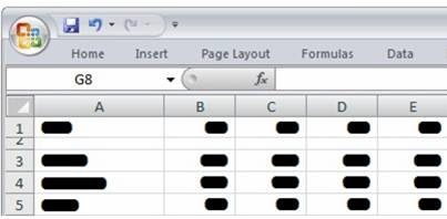
….what can be explained by the Gestalt law of Closure.
Hence we perceive the columns of numbers and headers still as a unit even though the headers are placed somewhat apart from the figures.
Image may be NSFW.
Clik here to view.
If we now disable the Excel grid lines we end up with table which merely relies upon white space and Gestalt laws to format the table providing clear associations: A first class table.
Image may be NSFW.
Clik here to view.
In western cultures we read text from left to right so it makes a lot of sense to left align text columns but not so for numeric columns. The eye has to search for the decimal point to get to the ten, hundred or thousand digit, this makes comparing numbers quite difficult if not impossible when many numbers are involved.
Image may be NSFW.
Clik here to view.
Here the Gestalt Law of Continuity can help, simply right aligning brings all tens, hundred, thousand digits on the same virtual line and makes comparison straightforward and simple.
Image may be NSFW.
Clik here to view.
Unsurprisingly, centering numbers in column causes exactly the same problem as shown below. Another visualization “No No”.
Image may be NSFW.
Clik here to view.
Interestingly, the same rules apply when we move beyond simple text and numbers to MicroCharts such as sparklines, column charts and bullet graphs. Especially when the sparklines contain m
issing values.
Image may be NSFW.
Clik here to view.
Right or center alignment leads to severe difficulty comparing values of the same period in different rows in the table.
Image may be NSFW.
Clik here to view.
If the sparklines have the same amount of data points this is not an issue but in dynamic reports this may not always be the case so its better to be safe than sorry.
Image may be NSFW.
Clik here to view.
When using visual tables another nice trick to is to introduce an axis to a column chart to aid in the visual alignment and to group periods into blocks through the alternate shadings. The column chart above use a column chart to visualize units sold and an area chart for the other measures. The different shading groups the periods into 6 month units and the column bars aids the visual alignment. So to recap, make it easy for people to read your tables by following how your brain inherently processes information as explained through “Gestalt” laws. Here are the rules again
- Right-align a block or column of whole numbers or of whole numbers and text.
- Left-align a block or column of whole text.
- Align numbers at the decimal point (or imaginary decimal point).
I hope that this article has been useful and I look forward to dealing with other visualization techniques in later posts.
